
Website navigation is one of the most important elements of user experience. Even the most beautifully designed website will fail if users can’t find what they need quickly. That’s why modern designers are getting more creative, thoughtful, and strategic with Navigation Designs. In 2026, we’re seeing a wave of innovative navigation patterns that are not only functional but also visually striking.
Whether you’re building a portfolio, eCommerce store, SaaS platform, or creative agency website, the right navigation design can elevate your entire user experience. Below are some of the most unique and impressive Navigation Designs that inspire engagement, enhance usability, and help your site stand out.
Why Navigation Designs Matter More Than Ever
Navigation is the bridge between a user and the content they want. Modern users expect speed, clarity, and intuitiveness. They don’t want to think-they want to move naturally through your website.
Strong Navigation Designs help by:
- Improving user flow
- Reducing bounce rates
- Increasing conversions
- Enhancing brand personality
- Making websites feel modern and professional
As websites become more interactive, navigation becomes an essential storytelling tool-guiding users through an experience, not just a menu.
#1. Mega Menu Navigation Designs
Mega menus are a powerful way to show a lot of information without overwhelming users. These Navigation Designs work well for:
- E-commerce websites
- Corporate platforms
- News and content-heavy sites
A mega menu typically includes categorized submenus, product previews, icons, images, or even short descriptions.
Why it impresses users
It offers clarity and structure while giving users a quick overview of everything available.
Pro tip: Use a clean grid layout and add subtle hover animations for a smoother experience.

#2. Hamburger Menu With Micro-Interactions
The hamburger menu has been around for years, but modern Navigation Designs are reinventing it through:
- Animated icons
- Sliding panels
- Expanding full-screen menus
- Cinematic transitions
This minimal approach keeps the interface clean while giving users a modern feel.
Why it impresses users
It creates a sense of discovery and keeps the focus on the main content.
Pro tip: Make sure the animation is fast-slow transitions frustrate users.
#3. Sticky Navigation for Smooth Browsing
Sticky or fixed navigation bars remain visible as the user scrolls. These Navigation Designs improve usability on long-scrolling pages or content-rich layouts.
Sticky navigation shows:
- Logo
- Important links
- Search bar
- Call-to-action button
This ensures users always know where they are and where to go next.
Why it impresses users
It reduces friction and makes browsing seamless.
Pro tip: Use a shrinking animation as users scroll for a more elegant, modern effect.
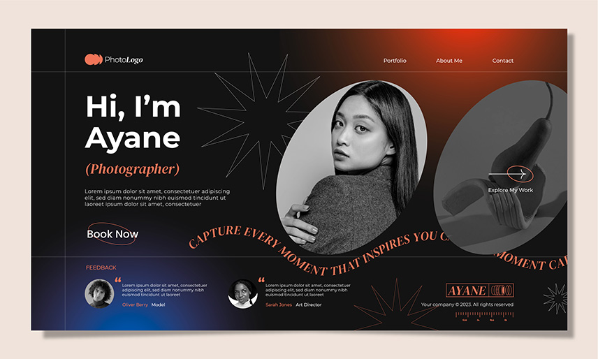
#4. Split-Screen Navigation Designs
Split-screen layouts divide the screen into two or more panels, often combining text with strong imagery. These Navigation Designs are especially popular in portfolios and creative agency websites.
Example structure:
- Left side: menu or description
- Right side: interactive visuals or previews
Why it impresses users:
It feels cinematic and allows for deeper visual storytelling.
Pro tip: Use bold typography and high-contrast color schemes to highlight the navigation elements.
#5. Vertical Navigation Bars (Modern Sidebars)
Vertical Navigation Designs are making a major comeback in 2026 because they offer more space and create a unique browsing experience.
They’re ideal for:
- Portfolios
- Blogs
- SaaS dashboards
Vertical nav bars help organize content into logical sections while maintaining a stylish, modern appearance.
Why it impresses users
It feels fresh compared to traditional top-bars and gives websites a unique structure.
Pro tip: Add icons alongside text labels to improve readability.
#6. Full-Screen Overlay Navigation Designs
Full-screen overlay menus take over the entire screen when activated, usually with a smooth fade or slide animation. These are commonly used in modern, minimalist sites where designers want to keep the homepage distraction-free.
These Navigation Designs often include:
- Large typography
- Grid layouts
- Images or videos behind the menu
- Stylish hover effects
Why it impresses users
It turns simple navigation into an immersive, creative experience.
Pro tip: Keep the menu items bold and simple-avoid cluttering the screen.
#7. Scroll-Triggered Navigation Designs
Scroll-triggered Navigation Designs reveal menus based on user movement. These menus may:
- Appear when scrolling up
- Hide when scrolling down
- Morph based on page sections
This gives navigation a dynamic, responsive feel that adapts to user behavior.
Why it impresses users:
It feels intuitive and reduces obtrusiveness, letting users focus on content.
Pro tip: Use soft transitions and micro-interactions to keep movement natural.
#8. Floating Action Button (FAB) Navigation
Popularized by mobile apps, FABs are now part of innovative web Navigation Designs.
Typically placed in the bottom corner, FABs expand into multiple navigation links when clicked. This improves accessibility and works especially well on mobile-first websites.
Why it impresses users:
It’s clean, modern, and keeps the interface uncluttered.
Pro tip: Use a simple icon (like “+”) that expands into 3–6 essential actions.

#9. Curved, Circular, or Non-Traditional Navigation Designs
More designers are moving beyond straight lines and rectangles. Circular menus and curved Navigation Designs add creativity, especially for:
- Creative portfolios
- Art websites
- Entertainment brands
Circular navigation can include rotating menus, interactive wheel selectors, or radial buttons.
Why it impresses users
It feels artistic and unexpected-perfect for standing out.
Pro tip: Ensure the interaction remains intuitive despite the unique shape.
#10. Content-Based Navigation Designs (Story Navigation)
Instead of relying on menus, some websites guide users through a scrolling story. Content sections act as navigation triggers, leading users through:
- Animations
- Chapters
- Scenes
- Visual storytelling
These Navigation Designs transform the website into an interactive journey.
Why it impresses users
It blends navigation with storytelling, keeping users engaged longer.
Pro tip: Keep your scroll animations optimized to avoid slow loading.
What Makes Navigation Designs Truly Impressive?
While creativity matters, the best Navigation Designs share a few universal qualities:
✔ Ease of Use: Users should instantly understand how to move around your site.
✔ Consistency: Menus should look and behave the same across the whole website.
✔ Speed: Fast transitions and lightweight scripts improve the experience.
✔ Accessibility: Ensure all Navigation Designs work well for users with disabilities.
✔ Visual Appeal: Bold typography, animations, icons, and colors all contribute to the overall aesthetic.
Final Thoughts: The Future of Navigation Designs
As we move deeper into 2026, designers are experimenting with Navigation Designs that combine beauty, functionality, and innovation. Unique navigation can define a website’s entire personality. When done right, it increases engagement, improves usability, and enhances brand identity.
Whether you prefer minimalism, bold animations, or immersive full-screen menus, there’s a Navigation Design style that fits your brand and audience.